
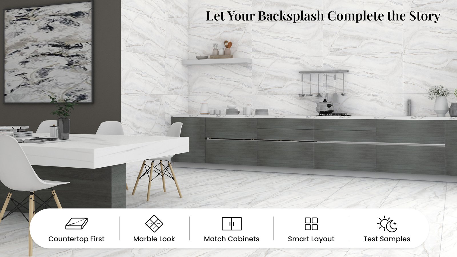
A kitchen backsplash may occupy a relatively small area, but it can have a defining influence on the entire kitchen. Positioned between the countertop and cabinetry, it brings these major design elements together, and offers an opportunity to introduce color, texture, or visual character.
The most successful kitchen backsplash tile designs do more than fill the wall. They create a thoughtful connection between the countertop, cabinets, and surrounding finishes. Whether the kitchen features a dramatic stone countertop or a simple, understated surface, the right backsplash can help the design feel complete.
At flavour Granito, a considered range of vitrified, porcelain, and ceramic tile designs offers inspiration for kitchens that balance style with everyday functionality.
Before selecting backsplash tiles, look closely at the countertop. Its color, pattern, and visual movement can help determine whether the wall should remain subtle or become a focal point of its own.
If the countertop features prominent veining or a detailed pattern, a more understated backsplash can create balance. Soft white, warm beige, or gentle gray tiles can complement the countertop without competing for attention.
On the other hand, a simple countertop gives the backsplash more room to express personality. A tile with a distinctive pattern, rich color, or appealing surface detail can introduce character while keeping the overall composition cohesive.
The goal is not to make every surface identical. It is to give each material a clear role in the kitchen design.
Marble-inspired tiles bring a refined, stone-like appearance to kitchen walls. Their veining and tonal variation can add depth to the backsplash, especially when paired with a countertop that has a quieter finish.
For a light and elegant kitchen, consider marble-look tiles alongside white, cream, or pale gray countertops. The combination can create a bright, coordinated setting without relying on an exact material match.
For kitchens with darker countertops, marble-look tiles with lighter backgrounds can provide contrast and help the backsplash stand out. A restrained palette allows the tile pattern to become a design feature while keeping the space visually balanced.
Explore the for tile designs that can inspire a range of marble-inspired kitchen looks.
The backsplash also connects the countertop to the kitchen cabinets. Its color can either echo a tone already present in the room or introduce a carefully chosen contrast.
Warm wood cabinetry, for example, can pair beautifully with cream, ivory, or beige backsplash tiles. These tones reinforce the natural warmth of the wood and create a welcoming atmosphere.
For kitchens with white or light-colored cabinets, a deeper backsplash shade can add definition. Soft charcoal, muted green, or other considered colors can bring visual interest while allowing the cabinetry and countertop to remain part of the overall composition.
A useful design approach is to choose one main color direction and repeat it subtly elsewhere, perhaps through cabinet hardware, lighting, or decorative accents. This helps the backsplash feel intentional rather than disconnected from the rest of the kitchen.
The way backsplash tiles are arranged can influence how the kitchen wall is perceived. Even when the color palette is restrained, the layout can add a distinctive design detail.
A horizontal arrangement can complement long countertops and emphasize the width of the kitchen. A vertical layout can draw the eye upward, making the backsplash feel taller. A more decorative arrangement can create a focal point behind the cooktop or another prominent area.
The layout should work with the kitchen’s proportions and the placement of cabinets, shelves, outlets, and appliances. Planning these details in advance helps the finished backsplash look considered and well integrated.
A backsplash should not be selected in isolation. Flooring, cabinet colors, countertop tones, and lighting all influence how a tile looks once installed.
A tile that appears warm in a showroom may look different under the kitchen’s lighting. Before finalizing the design, compare tile and countertop samples together and view them in the space at different times of day.
Grout color also matters. A grout shade close to the tile color can create a more continuous appearance, while a contrasting grout can emphasize the tile pattern and layout. The right choice depends on whether the backsplash is intended to blend into the design or become a more prominent feature.
For practical use, confirm that the selected tile is suitable for the intended backsplash area and follow the manufacturer’s recommendations for installation, cleaning, and maintenance.
A well-designed kitchen backsplash does not need to be the boldest element in the room. Its impact comes from how thoughtfully it relates to the countertop, cabinetry, and overall palette.
Whether you are planning a calm, coordinated kitchen or a space with a more expressive focal point, the right tile can help bring the design together. Flavour Granito’s collection of vitrified, porcelain, and ceramic tiles offers design possibilities for creating kitchen spaces with a considered balance of style and function.
Explore the Flavour Granito tile collection and find inspiration for your next kitchen design.
12-10-2026
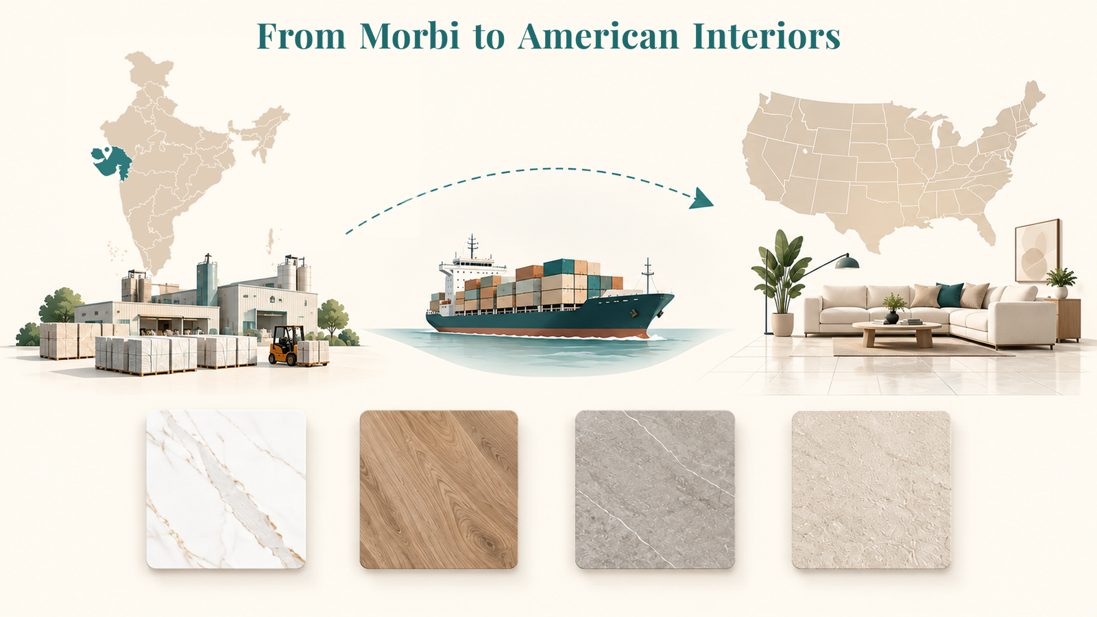
What started 25 years ago in Morbi, India’s ceramic hub, has grown into a trusted global brand. At Flavour Granito, we’ve built our legacy on creating tiles that blend artistry.
Quick Links
Available Sizes
Flavour Granito © . All rights reserved | Design and Managing By Roex Design